

Key Takeaways
Why Color Choice Matters Beyond Aesthetics
Color isn't just decoration — it's communication. The colors you wear near your face interact directly with your skin's natural pigmentation, either amplifying its warmth and radiance or muting it. This isn't a matter of subjective taste alone; it's rooted in how light reflects off adjacent surfaces and how the eye perceives contrast.
When a color harmonizes with your undertone, it can make skin appear more even and eyes appear more vivid. When it clashes, even a well-fitted garment can look flat or draining. Understanding this dynamic gives you a genuinely useful tool — one that works across trends, seasons, and whatever's currently dominating the fashion conversation.
For a deeper dive into how hue, saturation, and tone interact as underlying principles, see this guide to color theory fundamentals. The principles translate directly from interior design to personal style.
Understanding Undertones: Warm, Cool, and Neutral
Undertone refers to the subtle hue that sits beneath the surface of your skin — it doesn't change with a tan or fade in winter. The three categories are:
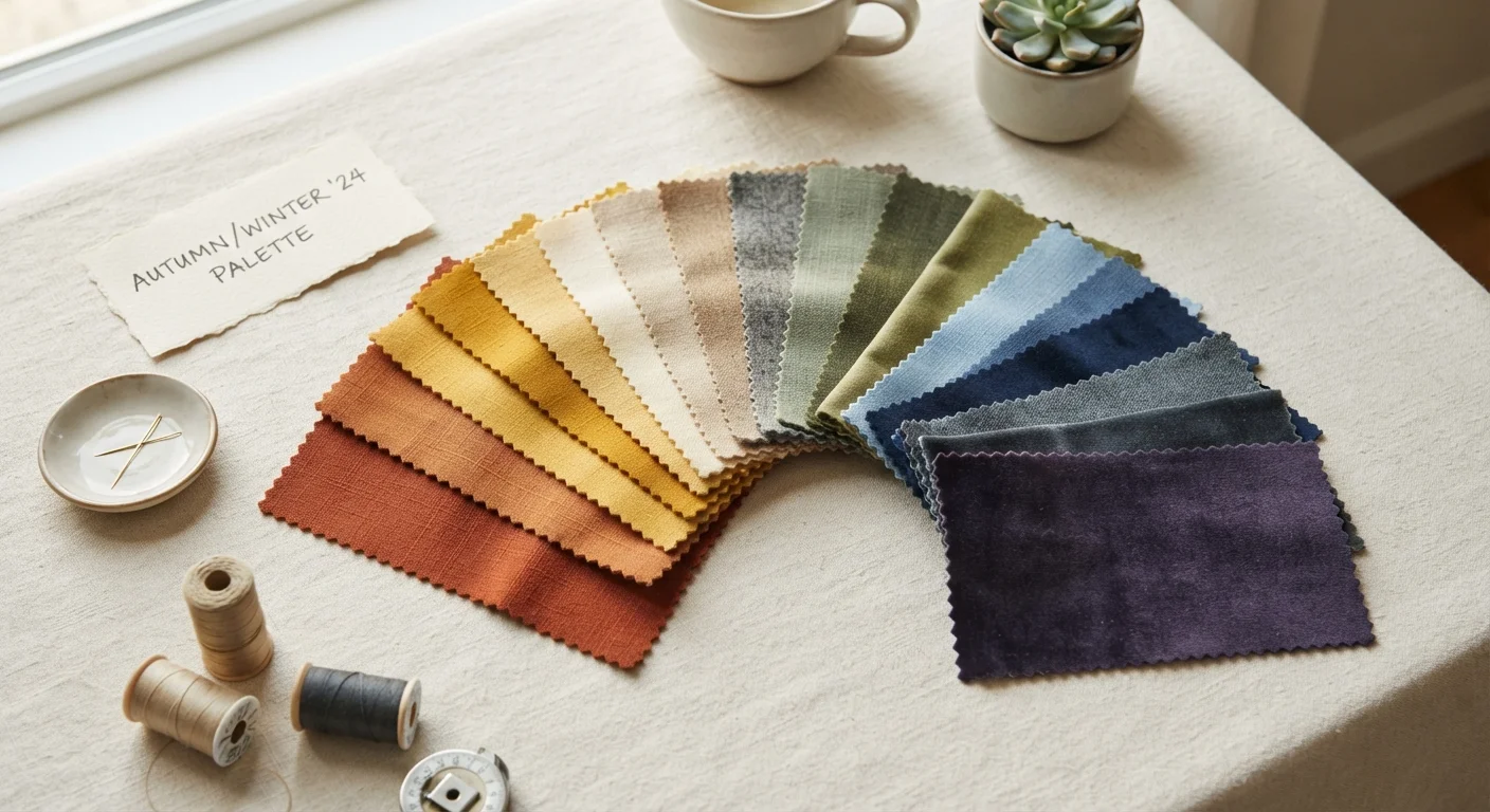
- Warm undertones have golden, peachy, or yellow-based hues beneath the surface. These skin tones often look their most vibrant next to earthy colors — terracotta, olive, mustard, warm browns, and rich oranges.
- Cool undertones carry pink, red, or bluish tints. They typically harmonize with jewel tones like sapphire, emerald, and amethyst, as well as true whites and icy pastels.
- Neutral undertones sit in between — neither decisively warm nor cool. People with neutral undertones often have flexibility across a broader color spectrum, though this can also make identification trickier.
It's worth noting that undertone is distinct from skin depth (fair, medium, deep). A person with deep skin can have a cool undertone; someone with fair skin can read as very warm. These are independent variables.
3
Undertone categories used in personal color analysis
Warm, cool, and neutral undertones are the foundational categories used by stylists and color analysts to assess color harmony with skin.
4–16
Seasonal palette subcategories, depending on system
The original four-season framework has been expanded by various practitioners to as many as 16 subcategories, reflecting the complexity of individual coloring.
~60%
Readers who misidentify their own undertone initially
Color analysis practitioners commonly note that a majority of clients initially misread their undertone, often confusing surface skin tone depth with undertone direction.
How to Identify Your Own Undertone
Several practical tests can help narrow down your undertone. None is definitive on its own, but taken together they provide a reliable picture:
- The vein test: Look at the veins on your inner wrist in natural light. Blue or purple veins suggest a cool undertone; green-tinted veins point toward warm; a mix suggests neutral.
- The white fabric test: Hold a pure white piece of fabric and an off-white or cream piece next to your bare face. If the bright white looks more flattering, you likely have a cool undertone; if cream feels warmer and more harmonious, your undertone is probably warm.
- The sunlight test: Step outside in natural (not direct) daylight and look at your skin without makeup. Does it appear golden or olive? Warm undertone. Does it look rosy or pinkish? Cool undertone.
- The jewelry test: Gold jewelry tending to look more natural on your skin suggests warm undertones; silver tending to look crisper suggests cool.
When conducting the vein test, do it immediately after coming inside from cold temperatures — veins are more visible and the reading is more reliable than when skin is flushed or warm.
Temperature affects surface blood flow, which can shift the visible hue of veins and skin, making undertone identification less accurate in warm or post-exercise conditions.
If you're genuinely stuck between warm and neutral, default to testing colors with a yellow-base first — neutral undertones typically handle warm shades more gracefully than cool ones handle them.
Neutral undertones share some yellow-base characteristics with warm undertones, meaning the error of leaning slightly warm is usually less visually disruptive than leaning too cool.
Lighting conditions matter enormously when conducting these assessments. Incandescent light skews warm; fluorescent light skews cool. For the most accurate read, always assess in consistent natural daylight — ideally overcast daylight, which is the most neutral.
Building a Personal Color Palette
Once you have a working hypothesis about your undertone, the goal isn't to restrict yourself to a narrow set of approved shades — it's to understand why certain colors feel right, so you can make more confident choices across categories.
A functional personal palette typically contains:
- Neutral anchors — the shades you'll wear most often and build around. These should harmonize with your undertone. For warm undertones, that might mean camel, warm taupe, or ivory rather than stark black or cool gray. Building a wardrobe around neutral colors has its advantages, but real constraints too — understanding the trade-offs helps you decide how far to lean into that strategy.
- Mid-range statement colors — shades you reach for regularly that still feel distinctly like you. These often relate to your contrast level (see below).
- Accent colors — used sparingly, often in accessories or layering pieces, these add flexibility without requiring full commitment.
Contrast level — the visual difference between your hair color, skin tone, and eye color — is a meaningful secondary variable. High-contrast coloring (think very dark hair against fair skin) generally supports bolder color combinations and sharper contrasts in an outfit. Lower-contrast coloring often looks more harmonious in tonal or softly blended palettes. Pairing this insight with texture and layering techniques adds visual depth without relying solely on color contrast.
Start With Your Neutrals, Not Your Accents
When building or editing your color palette, begin with the neutrals you'll wear most frequently — these have the biggest cumulative impact on how your wardrobe feels coherent. Once your neutrals are aligned with your undertone, accent colors become much easier to evaluate because you're assessing them against a harmonious base, not a random one.
Color Systems: Useful Framework or Overused Shortcut?
The seasonal color analysis system — which categorizes people into Spring, Summer, Autumn, and Winter types based on undertone and contrast — has genuine utility as a learning framework. It gives people a shared vocabulary and a starting point for self-discovery. But it also has real limitations when applied rigidly.
The system was developed decades ago, expanded over time into 12 or even 16 subcategories by different practitioners, and varies considerably depending on who's administering it. Results from two different analysts, or two online quizzes, can differ substantially. For a thorough breakdown of how the framework is structured, the seasonal color palette system explained is a useful reference.
“Color analysis works best as a language for self-understanding, not a set of restrictions. The moment it stops expanding your options and starts limiting them, you've misapplied the tool.”
— Kathryn Hendriks, Certified color analyst and personal styling educator
Where systems like these serve you best: as a diagnostic tool, not a rulebook. If being told you're a "Soft Autumn" helps you understand why terracotta feels more alive on you than cobalt blue, it has done its job. If it leads you to reject a color you genuinely love and feel good in, it has overstayed its welcome.
Trends are a separate matter. Seasonal fashion forecasts — what's being pushed by retailers each spring or fall — are largely unrelated to personal color analysis. Knowing your undertone means you can navigate fashion trends more selectively, pulling in what works for you rather than chasing the whole palette wholesale.
Putting It All Together in Your Wardrobe
Color confidence is less about memorizing rules and more about building a body of personal knowledge through observation. A few practical approaches:
- Wear a color near your face and photograph yourself in natural light. The camera captures what the eye sometimes normalizes — you'll see quickly whether a shade energizes your complexion or flattens it.
- Pay attention to compliments. If people consistently say you look well when you wear a particular color, that's data worth registering.
- Don't ignore pattern and print. A pattern with multiple colors introduces all of those undertones simultaneously. Understanding how to mix patterns helps you apply the same undertone logic to more complex combinations.
- Revisit your palette periodically. Hair color changes — whether natural or deliberate — shift your contrast level and can meaningfully change which colors feel most harmonious.
The goal is an intuitive, evolving literacy with color — one that allows you to shop, dress, and experiment with genuine confidence rather than anxiety. That kind of knowledge compounds over time and serves you regardless of what any particular season's trends prescribe.
Seasonal Colour Palette System, Explained
A thorough breakdown of how the four-season color analysis framework is structured, what it's based on, and how to use it practically when getting dressed.
Texture, Pattern, and Layering: Visual Tools for Outfit Depth
Once your color palette is in place, this guide covers how to use texture, pattern, and layering to add dimension — complementing your color choices rather than competing with them.
Building a Wardrobe Around Neutral Colors
A balanced look at the advantages and real limitations of a neutral-led wardrobe — useful context for deciding how large a role neutrals should play in your personal palette.