

Key Takeaways
High outfit compatibility across all pieces
When every item occupies the same tonal range, virtually any combination reads as intentional. This reduces decision fatigue and makes getting dressed efficiently much easier.
Longer perceived relevance of individual garments
Neutral pieces tend to sit outside seasonal colour trends, meaning they rarely feel dated in the way that trend-specific colours can within a year or two.
Easier to dress across multiple contexts
A camel coat or white shirt functions across formal, casual, and smart-casual settings without visual mismatch — useful for people whose daily life spans varied environments.
Creates a cohesive visual identity with minimal effort
An all-neutral closet produces an immediately recognisable personal aesthetic without requiring deep knowledge of colour theory or trend cycles.
Supports thoughtful, slower wardrobe building
Because the palette is constrained, each new purchase must genuinely integrate rather than simply add volume — which naturally encourages more deliberate acquisition habits.
Monotony without texture and silhouette variation
A rack of beige and grey pieces in similar fabrics and cuts can look undistinguished rather than refined. Maintaining visual interest requires deliberate work around proportion, weight, and surface finish.
Neutrals are not universally flattering
Cool-toned greys and warm-toned creams can clash against certain skin undertones just as dramatically as mismatched colours. The assumption that neutrals are a safe default ignores how undertone compatibility works.
Limits colour-based self-expression
Colour is a primary tool for personal identity and mood in dressing. Removing it entirely can make a wardrobe feel like a uniform rather than a form of expression.
Staining and soiling show more visibly
Light neutrals — white, ivory, cream — are highly susceptible to visible wear and staining, which can increase care demands and shorten practical garment life in active daily use.
May not meet all social or cultural contexts
Certain occasions, cultures, or workplace environments expect or reward colour. A rigid neutral palette can limit appropriate dressing options in contexts where visual expressiveness is valued or expected.
Risk of buying near-identical pieces
Within a narrow palette, distinguishing between slightly different shades of ivory or grey becomes genuinely difficult in-store. Many people end up with multiples of effectively the same item.
Our Verdict
A neutral wardrobe delivers genuine practical value — fewer dressing decisions, high mix-and-match potential, and a coherent visual identity. However, it demands intentional work around texture, fit, and proportion to avoid looking flat, and it may feel creatively restrictive for those who use colour to express personality. The approach works best as a structural foundation rather than a rigid rule.
Best suited to people with varied daily contexts who prioritise getting dressed efficiently and building a visually cohesive closet without constant trend investment.
What a Neutral Wardrobe Actually Means
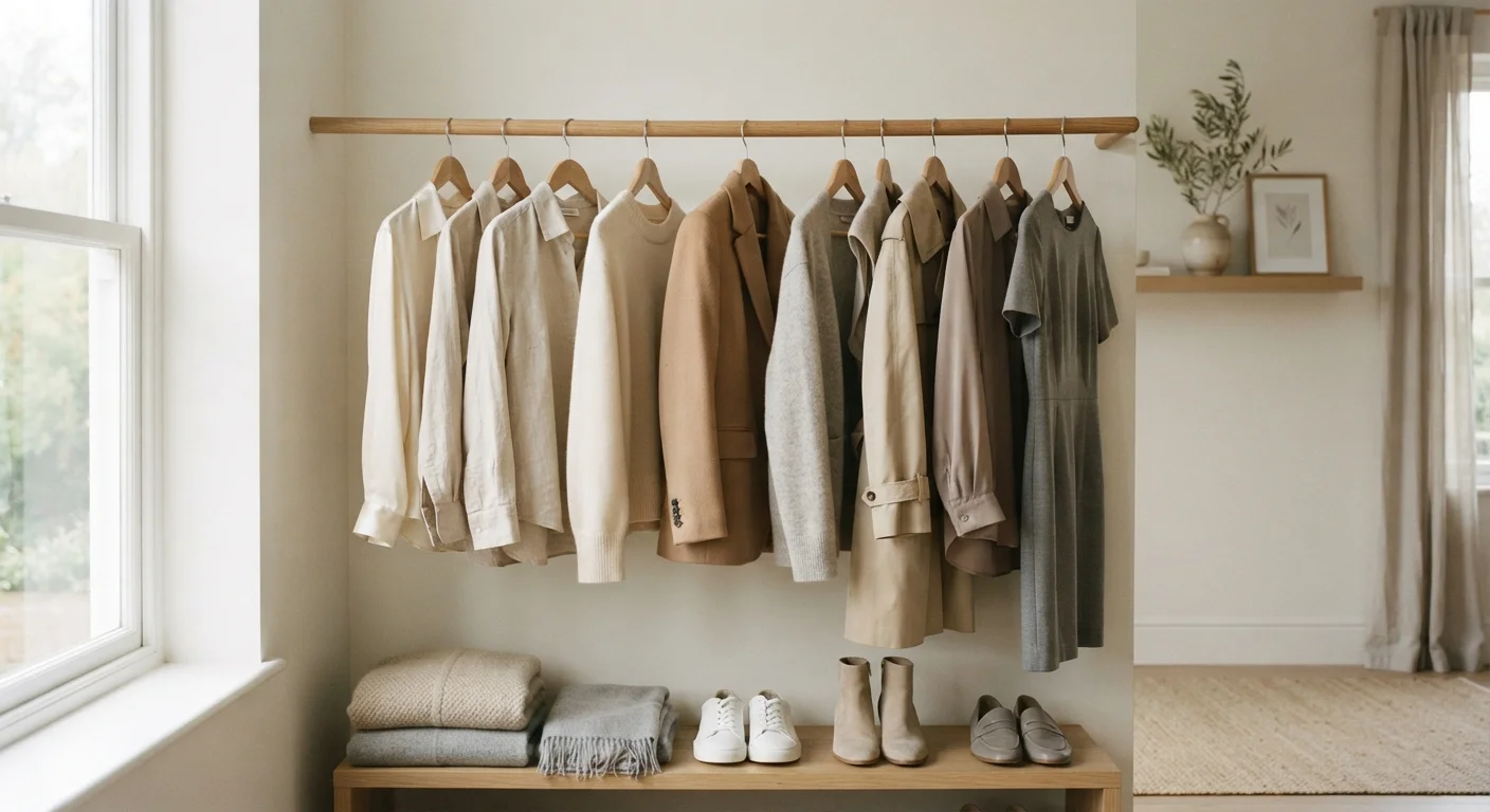
A neutral-colour wardrobe centres on a palette of whites, creams, beiges, tans, greys, blacks, and navy — shades that don't compete with each other and read as low-contrast across most combinations. The appeal is structural: when every piece operates within the same tonal range, outfit-building becomes faster and the likelihood of a combination looking coherent rises considerably.
This approach underpins both the capsule wardrobe philosophy and the quiet luxury aesthetic. As explored in capsule wardrobe thinking, the goal is fewer, more functional pieces rather than seasonal volume. Neutrals serve that model well — but the advantages aren't without real limitations.
High outfit compatibility across all pieces
When every item occupies the same tonal range, virtually any combination reads as intentional. This reduces decision fatigue and makes getting dressed efficiently much easier.
Longer perceived relevance of individual garments
Neutral pieces tend to sit outside seasonal colour trends, meaning they rarely feel dated in the way that trend-specific colours can within a year or two.
Easier to dress across multiple contexts
A camel coat or white shirt functions across formal, casual, and smart-casual settings without visual mismatch — useful for people whose daily life spans varied environments.
Creates a cohesive visual identity with minimal effort
An all-neutral closet produces an immediately recognisable personal aesthetic without requiring deep knowledge of colour theory or trend cycles.
Supports thoughtful, slower wardrobe building
Because the palette is constrained, each new purchase must genuinely integrate rather than simply add volume — which naturally encourages more deliberate acquisition habits.
Where the Neutral Approach Falls Short
The practical strengths of a neutral wardrobe are well-documented, but the drawbacks tend to surface gradually. The most common is visual monotony: without deliberate variation in texture, silhouette, and proportion, an all-neutral closet can produce outfits that feel undistinguished rather than refined. Fabric weight, surface finish, and layering structure become the primary design tools — which requires a more considered eye than simply mixing colours.
There's also the undertone problem. Neutrals are not a monolithic category — warm beiges and cool greys can clash as sharply as any two colours if worn against an incompatible skin undertone. Understanding your undertones is particularly relevant here, since the assumption that neutrals are universally safe is a common misconception.
Monotony without texture and silhouette variation
A rack of beige and grey pieces in similar fabrics and cuts can look undistinguished rather than refined. Maintaining visual interest requires deliberate work around proportion, weight, and surface finish.
Neutrals are not universally flattering
Cool-toned greys and warm-toned creams can clash against certain skin undertones just as dramatically as mismatched colours. The assumption that neutrals are a safe default ignores how undertone compatibility works.
Limits colour-based self-expression
Colour is a primary tool for personal identity and mood in dressing. Removing it entirely can make a wardrobe feel like a uniform rather than a form of expression.
Staining and soiling show more visibly
Light neutrals — white, ivory, cream — are highly susceptible to visible wear and staining, which can increase care demands and shorten practical garment life in active daily use.
May not meet all social or cultural contexts
Certain occasions, cultures, or workplace environments expect or reward colour. A rigid neutral palette can limit appropriate dressing options in contexts where visual expressiveness is valued or expected.
Risk of buying near-identical pieces
Within a narrow palette, distinguishing between slightly different shades of ivory or grey becomes genuinely difficult in-store. Many people end up with multiples of effectively the same item.
Context, Lifestyle, and the Limits of a Rule
How well a neutral wardrobe performs depends heavily on how someone actually lives. For professionals in formal or business-casual environments, it can be a genuine efficiency tool. For people whose daily life spans creative fields, social occasions requiring personality, or simply personal joy in colour, a rigid neutral palette may create a closet that doesn't reflect real needs.
Neutrals Are Not One Palette
The category spans a wide undertone spectrum — warm (ivory, camel, tan, warm grey) and cool (pure white, charcoal, cool taupe, navy). Mixing across these sub-groups without awareness can produce combinations that look unintentionally off. Before committing to a neutral base, identifying whether your natural colouring reads as warm or cool helps considerably. This is general guidance; individual results vary and personal experimentation remains the most reliable test.
Mapping your real daily contexts onto wardrobe decisions is a more reliable method than adopting a palette-based rule wholesale. The neutral wardrobe works best as a structural foundation — a high-compatibility base that can absorb deliberate colour accents — rather than an all-or-nothing commitment. It's also worth noting that building this foundation through rapid wholesale replacement carries its own risks, as outlined in common wardrobe overhaul mistakes.
~70%
Wardrobe items worn regularly by most people
Research into consumer wardrobe habits consistently suggests most people regularly wear only a fraction of what they own, regardless of colour palette — underlining that curation matters more than any single rule.
3–5
Core neutral tones in a functional base palette
Style educators generally recommend anchoring a neutral wardrobe around three to five tones that share undertone compatibility — mixing warm and cool neutrals without this check is a common source of wardrobe incoherence.
For those drawn to expressive dressing, the neutral-heavy approach contrasts with more maximalist frameworks — a tension explored in quiet luxury versus maximalism. Neither direction is inherently superior; both require deliberate choices rather than default ones. And if the neutral wardrobe is partly a hedge against trend fatigue, it's worth understanding how trend-driven shopping habits quietly drain a wardrobe regardless of palette.