

Key Takeaways
Colour Theory
Colour theory is the study of how colours relate to one another and how they affect visual perception. In interior design, it helps you predict how colours will behave when placed together in a room — on walls, furniture, textiles, and trim. The three core properties — hue, saturation, and tone — determine not just the colour you see, but how that colour feels in a space.
In technical colour models, these properties map roughly to hue (the colour's position on the spectrum), chroma or saturation (colour intensity), and value or tone (lightness to darkness). Paint manufacturers and design professionals use these distinctions when formulating and specifying colours.
The Three Properties Every Colour Has
Every colour you encounter — on a paint chip, a sofa, or a curtain panel — can be broken down into three distinct properties: hue, saturation, and tone. Grasping these independently gives you a language for diagnosing why a colour scheme works or doesn't, and how to correct it.
Hue is simply the colour family — red, yellow, blue, green, and all the steps between. It's the most intuitive property, the one most people refer to when they say "I want a blue room." But hue alone tells you very little about how a colour will actually behave on a wall.
Saturation describes the intensity or purity of a hue. A fully saturated red is vivid and demanding. Reduce its saturation and you move toward dusty rose, then muted blush, then a warm grey. The hue hasn't changed — it's still rooted in red — but the visual experience is entirely different.
Tone refers to how light or dark a colour is, independent of its hue or saturation. A pale sky blue and a deep navy are the same hue at different tones. Tone is what determines whether a colour feels airy or grounding, expansive or intimate.
Why Paint Chip Names Can Mislead
Paint manufacturers often assign evocative names — "Driftwood," "Misty Morning," "Claret" — that may not accurately describe a colour's actual hue, saturation, or tone. Two paints both named variations of "sage" can differ substantially in their green undertone, saturation intensity, and lightness. Always evaluate the actual colour chip, not the name, and test it in your specific room's light.
Why Mismatched Saturation Creates Visual Tension
When homeowners describe a colour scheme that feels "off" but can't identify why, mismatched saturation levels are usually responsible. A highly saturated accent pillow placed against a muted, low-saturation wall creates a jarring contrast that draws the eye uncomfortably — not because the hues clash, but because their intensities are out of step.
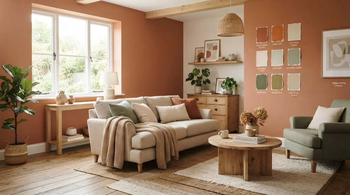
This is the most practically useful insight from colour theory: you can mix almost any combination of hues if you keep their saturation levels consistent. A room furnished entirely in dusty, muted tones — sage green, faded terracotta, warm stone — reads as cohesive and intentional even though the hues span a wide range. Introduce a single highly saturated element, and the room's harmony fractures.
The reverse is equally true. A vibrant, maximalist scheme works when every colour in the room is similarly intense. The problem emerges at the boundary between saturated and desaturated — which is why that single bright throw pillow on a neutral sofa either looks like a deliberate statement or an oversight, depending on how intentionally it's handled.
Tone, Light, and the Way Rooms Feel
Tone is the property most directly responsible for how a room feels spatially. Lighter tones reflect more light, making rooms feel larger and more open. Darker tones absorb light, creating enclosure and intimacy. This isn't purely psychological — it's a function of how surfaces interact with available light sources.
That interaction with light is also what makes testing colours in context so important. The same hue at the same saturation can read entirely differently depending on the room's orientation, the quality of its windows, and the type of artificial lighting installed. See our guide on natural light vs. artificial light in interior design for a deeper look at how to account for both when planning a palette.
Paint finish compounds this further. A flat matte paint absorbs light and softens tone, making colours appear slightly more muted. A semi-gloss finish bounces light back, intensifying perceived saturation. Our article on interior paint finishes and sheen explains how to match finish to surface and room type — a decision that directly affects how your chosen colours ultimately read.
Test in Large Patches, Not Small Swatches
Small paint chips on a card can be misleading because our perception of colour shifts with the size of the colour field — a phenomenon called simultaneous contrast. Paint a section of wall at least 12 inches square, ideally larger, and observe it over several days at different times. This gives a far more accurate preview of how the colour will read once the room is complete.
Applying Colour Theory to Real Decorating Decisions
Understanding hue, saturation, and tone transforms colour selection from guesswork into a structured process. Before committing to a palette, consider each element in the room — walls, flooring, furniture, textiles — and assess the saturation and tone of each. Where the range is too wide, the room will feel incoherent. Where it's too narrow, the result may feel flat.
A practical starting point: choose your dominant wall colour and identify its saturation and tone. Then select secondary and accent colours that share similar saturation while varying hue and tone for contrast. This approach allows for visual interest without the risk of colour competition.
These same principles apply beyond walls. Pattern mixing — in rugs, cushions, and upholstery — follows parallel logic: patterns at similar scales and colour intensities coexist more easily than those that differ dramatically in both. Similarly, understanding how colour interacts with texture adds another layer of visual sophistication, as explored in our piece on texture, pattern, and layering in visual styling.
Colour theory doesn't prescribe a single correct answer. It gives you a framework for understanding what you're looking at — and a reliable method for adjusting when something isn't working.
90%
Snap judgements about products influenced by colour alone
Research cited in colour psychology literature suggests the vast majority of initial product assessments are based primarily on colour, underscoring its powerful role in perception.
3–5 days
Recommended observation period for paint samples
Interior design professionals commonly advise observing large paint samples in situ across multiple days and lighting conditions before making a final selection.