

Key Takeaways
Why Depth Is the Missing Variable in Most Outfits
Most style advice focuses on color and silhouette — and both matter enormously. But outfits that feel genuinely compelling tend to have something else operating beneath the surface: depth. The kind you feel before you fully understand it. That quality almost always comes from how texture, pattern, and layering are working together — or failing to.
These three tools are not advanced techniques reserved for stylists or fashion insiders. They're learnable visual principles, and once you understand how each one functions, you can apply them to clothes you already own. Before going further, it's worth grounding this in the basics: as covered in our guide to proportion and fit, no amount of visual layering rescues an outfit where the clothes don't fit correctly. That foundation comes first.
With that established, here are the core principles that turn flat outfits into visually dimensional ones.
Use Texture Contrast as Your Starting Point
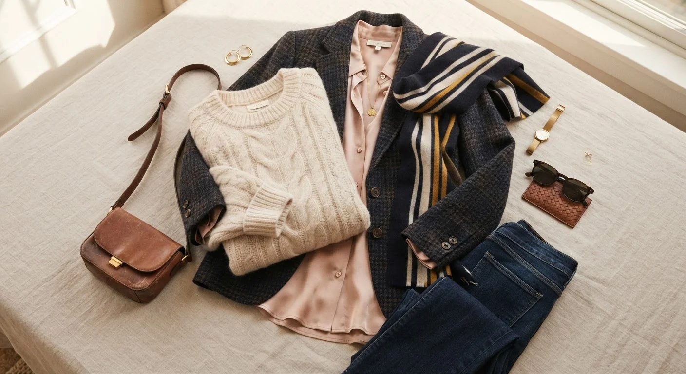
Texture is the most underutilized styling tool available, largely because it operates subtly. The brain registers the difference between a cable-knit and a satin blouse before the eye consciously identifies the materials. That contrast — rough versus smooth, matte versus reflective, stiff versus fluid — is what gives a monochromatic or tonal outfit its sense of richness.
Start by identifying the dominant texture in an outfit and then deliberately introduce its opposite. A chunky ribbed sweater pairs compellingly with tailored wool trousers. A sheer organza blouse reads differently against denim than it does against leather. The contrast does the visual work. For a deeper understanding of how fabric properties shape the overall look, fabric weight and drape is a practical starting point.
Pairing a rough texture against a smooth one does more visual work than a color change ever could.
Let Scale Drive Your Pattern Choices
When multiple patterns appear in one outfit, the most reliable principle governing their success is scale variation. A large-scale floral and a micro-check can coexist comfortably; two medium-scale florals in different colorways tend to compete and create visual noise instead of harmony.
The secondary principle is a shared color anchor — at least one hue that appears in both prints. This creates an invisible thread that ties the combination together. Without it, even well-scaled patterns can look accidental rather than intentional. Pattern choice also connects to the overall fashion trends landscape, but the scale-and-anchor principle works independently of what's current in any given season.
Scale variation is the rule that makes pattern mixing look intentional rather than coincidental.
Layer With Purpose, Not Just Warmth
Layering is often treated as a practical solution to weather. Functionally it is — but stylistically, each layer should have a defined visual role. A structured blazer over a relaxed tee introduces contrast in formality and weight. A longline cardigan worn open over a fitted dress changes the outfit's silhouette and proportion. A silk scarf worn loosely adds both pattern and a different fabric weight to the composition.
The test is whether removing any single layer would make the outfit feel incomplete or just the same. If you could remove it without consequence, it may not be doing visual work. Layering is also how you build outfit flexibility — the same base pieces read differently depending on what's added over or under them.
Every layer should earn its place by adding a distinct visual or structural function.
Build Tonal Outfits Through Material Variation
Tonal dressing — wearing a single color or a narrow color family head-to-toe — is one of the most elegant approaches to outfit building. Its weakness is flatness: when every piece shares the same hue and the same texture, the look can feel underdeveloped.
The solution is to vary material. A beige outfit that moves from linen trousers to a satin camisole to a suede jacket uses the same color anchor but reads as layered and considered. The eye travels across the different surfaces and finds them interesting in their contrast. This technique works especially well for readers who feel uncertain about color mixing — tonal dressing with material variation delivers depth while keeping the palette cohesive.
Tonal dressing becomes sophisticated when the palette stays narrow but the materials change dramatically.
Use a Neutral Layer to Anchor Complexity
When texture and pattern are both present in an outfit, visual complexity can tip toward overstimulation. The corrective is a neutral anchor — typically a clean, smooth, solid-color layer in a muted or neutral tone that gives the eye somewhere to rest.
This might be a white button-down under a heavily textured vest, a black turtleneck under a patterned blazer, or a camel coat worn over a printed dress and patterned tights. The neutral layer acts as punctuation: it separates the louder elements and makes the overall outfit feel edited rather than chaotic. The principle applies regardless of which patterns or textures are involved — the neutral simply needs to be quieter than everything around it.
A clean neutral layer is the element that keeps a complex outfit from reading as overcrowded.
Understand Where Visual Weight Falls
Visual weight — how heavy or light a garment reads — is determined by its color depth, texture density, and pattern scale, not by actual mass. A dark, heavily textured piece reads as visually heavy; a pale, smooth, lightly patterned piece reads as light. In layered or pattern-mixed outfits, that weight needs to be distributed with some intention.
A useful default is to concentrate visual weight toward the bottom of the outfit — heavier fabrics or darker tones at the waist and below — which grounds the look and feels balanced. The reverse (heavy elements at the top, light at the bottom) can feel top-heavy unless a strong anchor — a wide belt, a defined waist — corrects the proportion. This connects directly to how fit and proportion interact, which is why those foundations matter before adding visual complexity.
Visual weight is determined by color, texture, and pattern density — not by physical mass.
Putting It All Together
The real skill isn't mastering each tool in isolation — it's knowing when to let one do the heavy lifting and when to bring in the others. A heavily textured outfit in a tonal palette may not need pattern at all. A bold printed piece often works best with simple, smooth layers that let it breathe.
Start With One Variable, Not Three
When applying these tools for the first time, resist the urge to experiment with texture, pattern, and layering simultaneously. Choose one as your focal point for an outfit and keep the other two subordinate. A single strongly textured piece, for example, can anchor an otherwise simple look without requiring pattern or elaborate layering. Building competence one variable at a time makes the results easier to read and adjust.
If pattern mixing specifically interests you, the principles behind mixing prints offers a deeper look at why certain combinations read as intentional and others fall apart. And if you're still working out your broader aesthetic direction, the style archetypes framework can help clarify which visual tools feel most natural to your personal style. Color, of course, doesn't operate separately — understanding undertones and palettes is what connects all three tools to a coherent personal palette.
Think of texture, pattern, and layering not as rules but as a visual vocabulary. The more fluent you become, the less effort each outfit requires.
These Principles Translate Beyond Fashion
The same logic behind layering textures and patterns in clothing applies to interior spaces — rugs, throws, and cushions work by similar visual rules. If you find these principles intuitive in dressing, you may notice they extend naturally to how you think about arranging a room. Our editorial coverage of how textiles shape a room's character explores the parallel in depth.