

Key Takeaways
Why Pattern Mixing Goes Wrong
Mixing patterns in a room is one of the most expressive moves in home décor — and one of the trickiest to pull off. When it works, a layered mix of stripes, florals, and geometrics feels curated and alive. When it doesn't, the room feels restless and hard to settle into. The difference usually isn't talent or taste — it's a handful of specific, avoidable mistakes.
The good news: pattern mixing follows learnable logic. Once you understand the rules, you can confidently break a few of them. For foundational principles behind what makes combinations succeed, see our guide to pattern mixing principles. This article focuses specifically on where people most commonly go wrong.
Using patterns at the same scale throughout the room.
Why it happens: When shoppers find prints they love, they often buy them without considering how the sizes relate to each other — leading to a visually flat, busy result.
Mixing patterns with no shared color thread.
Why it happens: People focus on the shapes and motifs they like rather than checking whether the colors across patterns relate to each other.
Overcrowding every surface with pattern, leaving no visual rest.
Why it happens: Enthusiasm for a theme or aesthetic can lead to layering prints on every cushion, curtain, rug, and wall covering simultaneously.
Combining patterns from clashing style families.
Why it happens: Shoppers sometimes mix prints they find individually appealing without considering whether the visual language of each belongs to a compatible aesthetic.
Placing the largest, boldest print in a small or awkward spot.
Why it happens: A striking pattern on a small accent piece often draws the eye first, pulling attention to an unintended focal point and destabilizing the room's visual hierarchy.
Building a Room That Actually Holds Together
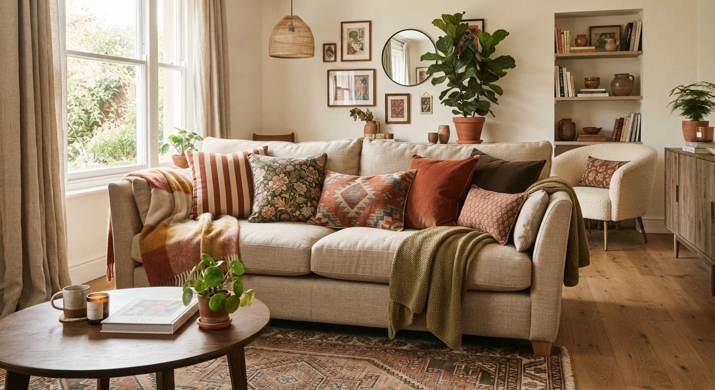
Once you've identified what's throwing off a space, the fix is rarely a complete overhaul. Most rooms just need one anchor decision — usually a single large-scale, well-loved print — and then secondary patterns chosen in relation to it. Think of it as building a hierarchy: one pattern leads, one or two support, and the rest of the room rests.
3–4
Patterns typically recommended per room
Interior design educators broadly suggest limiting active patterns to three or four per space to maintain cohesion without visual monotony.
60/30/10
Color distribution rule used in décor
A widely used interior design guideline distributes room color as 60% dominant, 30% secondary, and 10% accent — a framework that applies equally to pattern emphasis.
Color is your most powerful unifying tool. Pull two or three tones from your anchor print and repeat them in the supporting patterns — even if the shapes and scales differ wildly, that shared palette will hold everything together. For a broader look at how layering works across texture and print, our article on texture, pattern, and layering walks through the visual tools that add depth without chaos.
If you're starting a room from scratch, it also helps to establish your layout and color direction before introducing any pattern. Room styling from scratch gives a clear starting framework for first-time decorators who want to layer confidently from the beginning.
Avoid Buying Patterns in Isolation
One of the most common reasons pattern combinations fail is that each piece was purchased and loved on its own, without being considered against what was already in the room. Whenever possible, bring fabric swatches or photographs of existing patterns when shopping for new additions. Seeing them side by side before committing prevents the most common clashes.