

Key Takeaways
Visual Weight
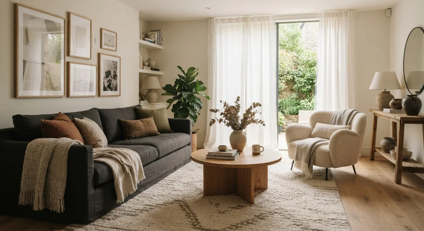
Visual weight refers to how heavy or light an object appears to the eye — not its actual physical mass, but its perceived presence in a space. Dark colors, large shapes, bold patterns, and dense textures all carry more visual weight than their light, small, or minimal counterparts. When the visual weight in a room is distributed thoughtfully, the space feels balanced and intentional. When it isn't, rooms can feel lopsided, cluttered, or oddly empty.
In design theory, visual weight is closely tied to the Gestalt principles of perception — particularly figure-ground relationships and the human tendency to group similar elements. Designers often use it as a calibration tool when assessing spatial hierarchy.
Why Some Rooms Just Feel Right
You've walked into a room and immediately felt at ease — and walked into another that felt vaguely wrong without being able to say why. In many cases, what you were sensing wasn't the furniture style or the color palette. It was how visual weight was distributed across the space.
Visual weight is one of those behind-the-scenes principles that professional decorators rely on constantly but rarely name out loud. Once you understand it, you'll start seeing it everywhere — in rooms that feel grounded and calm, and in rooms that feel restless or heavy.
If you're just starting to think about how your space is put together, this foundational decorating guide covers the broader decisions — layout, color, and scale — that work alongside visual weight.
60–30–10
The classic color distribution rule for rooms
Interior designers commonly recommend using three colors in a 60% dominant, 30% secondary, and 10% accent split to maintain visual balance — a practical application of managing visual weight through color.
~70%
Of décor decisions driven by perceived scale
Design research consistently finds that scale and proportion — core components of visual weight — are among the most cited reasons homeowners feel a room doesn't come together as expected.
What Creates Visual Weight
Visual weight isn't one thing — it's the combined effect of several visual properties working together. Understanding each one gives you real control over how a room feels.
- Color: Dark colors recede visually but feel heavy and grounding. Light colors feel airy and expansive but carry less perceptual presence.
- Scale: Larger objects naturally draw more attention. A single oversized piece often carries more visual weight than several smaller ones grouped together.
- Texture: Rough, layered, or dense textures feel heavier than smooth, reflective ones. A raw linen sofa reads as weightier than one upholstered in a light cotton.
- Pattern: Bold, high-contrast patterns increase visual weight; subtle or tone-on-tone patterns reduce it.
- Opacity: Solid, opaque materials feel heavier than open or transparent ones. A glass side table carries almost no visual weight compared to a solid wood one of the same size.
Textiles, in particular, are one of the most accessible ways to add or subtract visual weight without replacing furniture. Layering textiles thoughtfully — rugs, curtains, throws, and cushions — can meaningfully shift a room's visual balance.
Try the Squint Test Before Rearranging
To quickly assess how visual weight is distributed in a room, take a photo and then squint at it. Squinting removes fine detail and lets you see the distribution of dark and light masses clearly. If one area looks significantly heavier, that's your starting point for rebalancing — no furniture moving required yet.
How to Distribute Visual Weight in a Room
The goal isn't to make every corner identical — it's to ensure that no single zone so dominates the room that it pulls all attention and leaves the rest feeling vacant. Here's how to assess and adjust:
- Identify your anchor piece. Most rooms have one element that carries the most visual weight — a dark sofa, a large bookcase, a statement rug. Start there.
- Map the rest of the room. Stand at the entrance and note where your eye goes after the anchor. Do lighter zones feel abandoned? Does one wall feel overloaded?
- Add or reduce weight deliberately. A heavy corner can be lightened with reflective surfaces or sheer fabrics. A bare wall can gain presence with a dark-framed grouping, a bold-toned piece of art, or layered shelving.
- Use lighting as a calibration tool. Natural and artificial light both affect how objects register visually. A lamp positioned to highlight a lighter area can shift the perceived balance without moving furniture.
Asymmetrical balance — where different objects carry equivalent visual weight without mirroring each other — is often more interesting than strict symmetry and tends to feel more lived-in and personal.
Visual Weight and Open-Plan Spaces
In open-plan layouts, visual weight needs to be considered across the entire footprint, not just within individual zones. A heavy dining table and a dark sofa in the same sightline can create a density that makes the space feel smaller than it is. Open-plan layouts introduce specific challenges around how zones are visually defined and separated — understanding visual weight helps address many of them.
Putting It Into Practice
The most practical first step is also the simplest: take a photograph of the room. The camera compresses depth in a way that makes visual weight imbalances much easier to spot. Squinting at the image can also help — it removes detail and lets you see the underlying distribution of light and dark.
If you want to plan changes before moving anything, a visual moodboard is a useful tool. Collecting images that reflect the balance you're aiming for gives you a reference point for every decision. Building a style moodboard works for interior spaces just as well as it does for personal style — the principle is the same: identify patterns in what draws your eye.
Visual weight is a quiet principle, but it does a lot of the work in rooms that feel settled and right. Once you start seeing it, rearranging a room stops feeling like guesswork and starts feeling like a skill.